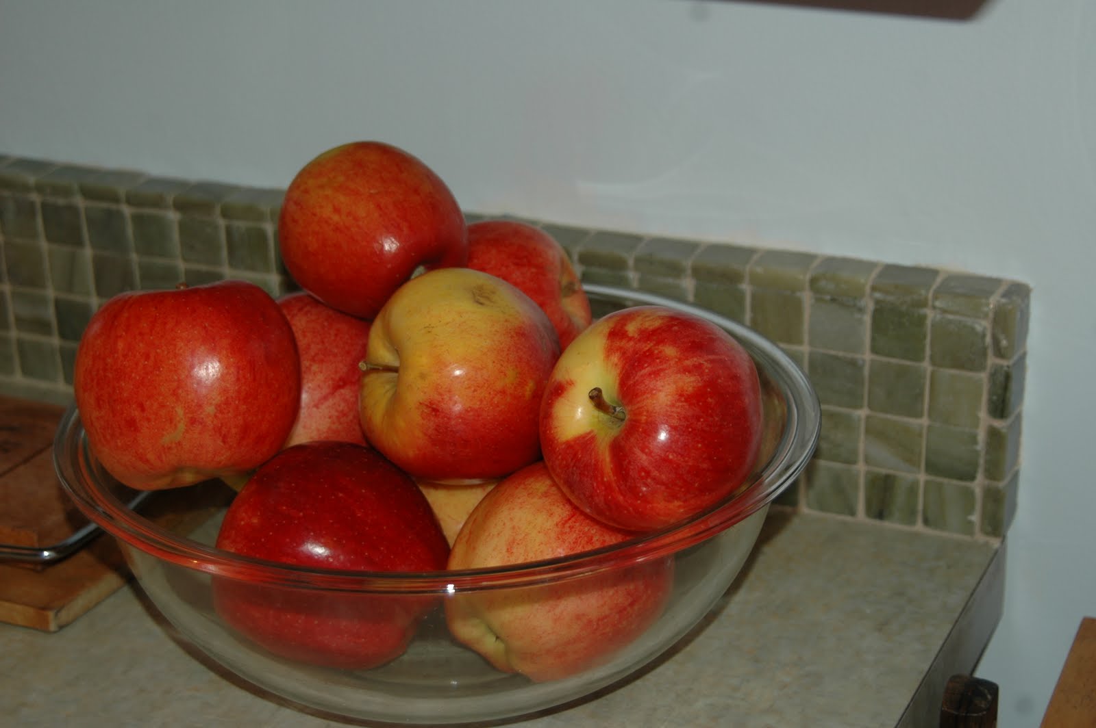
Showing posts with label kitchen. Show all posts

Tuesday, September 14, 2010

Kitchen Remodel Over

It is done -- our kitchen remodel or makeover is over. First lets take a peek what it used to look like. It was this aging, off-white kitchen that was begging for a new lease on life. It took 2-3 weeks to do not including all the pre-planning I did. I think it is important to pick everything you can possibly think of before the contractor comes, because you will always have stuff to get that you couldn't conceive of during the job. I feel that getting everything ready really saved us labor costs. Plus I was always willing to be gopher for my contractor so he can concentrate on getting tasks done.

It originally was a project to just replace the cooktop. Then you have to replace the counters. Then you should have a backsplash and then you gotta paint. If you paint you have to fix the walls. If you fix the walls, then you need to replace the light fixtures. If you replace the light fixtures, you will have to fix the faulty wiring you inherit. Sixty percent of the remodel went to labor and much of the work you do not see because they are fixes.

We reused our cabinets but tore out the soffit and put moulding up. We also added trim to them to give the cabinets new life for a small amount of time and money. The soffit above served no real purpose but to rob us of usable storage space. Prior to this I had nowhere to put my Lenox Butterfly Meadow Tea Set, now I do.

My goal was to bring color, character, and functionality to our kitchen without changing the footprint or layout of our kitchen. I couldn't do anything over the top since this kitchen is small and we live in a modest ranch home.

Tada! So here is the reveal. We have Metal Ocean Formica counters that features greens, blues, grays, and golds. For the backsplash, I used Verde Laguna Marble tile. The cooktop is a 30" Wolf gas cooktop. The marble is the splurge even though 8 sheets of it was $80 off eBay, the labor involved was significant because while my contractor can lay tile, but is attention to detail slows him down when dealing with small tile. I helped out by putting in all the spacers for him. Once he laid the tile, I took over and grouted, impregnated, and sealed the tile myself. By that time we were aware that we have hit the top end of our budget. So, we ended up taking care of the finishing touches ourselves.

Of course, it all started with replacing the cooktop. We had to cut off the existing bar because it was a fire hazard and looked dated. The person who had installed the bar, didn't do the proper measurements, and so there was an overhang over the back burners. I decided just to have our contractor make it a flat peninsula. I think this makes it look much more modern. People can pull up chairs and talk to me while I cook or prepare food. Before the bar was just a place to put stuff and it created a barrier between the kitchen and the living room.

We also replaced the exhaust fan since it had not worked since we moved in. We had the most unpleasant task cleaning out all the grease up there. It now works like a charm and the original fixture sparkles and adds to the stainless steel/chrome accents for the kitchen. If we need to have a better exhaust system we can purchase a rooftop fan for about 200-300 bucks and it will give us a significant amount of CFMs. We had a real problem finding an affordable hood that wouldn't take up the tiny kitchen and be low profile. So far we haven't found we needed the extra CFMs.

We have since moved the DVDs shown here and moved up a hutch for our dining room area now that our son is old enough to have furniture with glass.The hutch is an old one that has been beaten up over the years, but I was able to clean it up and accessorize it to hussy it up a bit.

Eventually I would like to put a wine rack and shelf  from Pottery Barn up around it. It would be nice to have a place to store our wines.

It makes me happy we have a proper dining room area that is more adult. It makes me happier that we didn't have to spend anything in accomplishing that. I just used what I had stored away. This looks better when I have a table cloth that is burnt orange
I am really liking how the tile came out. There is a real variation to the tile from dark to pale green with streaks of gold or white. There are pictures below that show the variations better, but this is a nice close up against the Metal Ocean counter.

I got the idea of pairing tile with the Formica by searching for photos on the Internet and noticed all the photos I liked of the Formica had a tile backsplash rather than a Formica one. It was a gamble to get the tile when I really couldn't see the countertop until it was finished an delivered. Swatches, even large ones do not do the design justice. It really looks better than the swatches suggest. Fortunately the countertop and tile work well together and both work well with the wall color.

The only catch was the wall color, Kelly Moore Calypso Breeze, turns out to be not the color we used in the living room after all. The livingroom is more a greenish blue than Calypso Breeze, which is more of a proper blue. I am now thinking this color was some wacky custom shade we will never figure out.


Removing the soffit allows me to store and display my tea set and bring in my Quan Yin statue. Did I tell you how much I love that moulding? It was beautifully done and just adds that special something to the kitchen. The cabinets look more solid and hides the fact that these cabinets were resurfaced in the 1980s. I really love how the wall color goes with the tea set and statue, but also with the cabinets. I really put thought into how all the color choices I made complemented each other.

We added more storage with stainless steel shelving from a restaurant supply store. They are both 84"  18 gauge stainless steel shelves. They replaced white shelving that was not very appropriate for kitchen use. We reused them down in the garage that we turned into a game room for all the boardgames we have. I like that there is a lip that will keep things from falling off. Again, I am happy how the stainless steel goes with the wall color.


The curtains are linen shades from Pottery Barn, which give privacy and window dressing without sacrificing natural light.

Speaking of light, we replaced the light fixtures. The one you see in this photo has a green design on the frosted glass. New lighting fixtures are a simple way to update the space.

The table there is for groceries, homework, and for me to organize stuff. I can help with homework and make dinner.

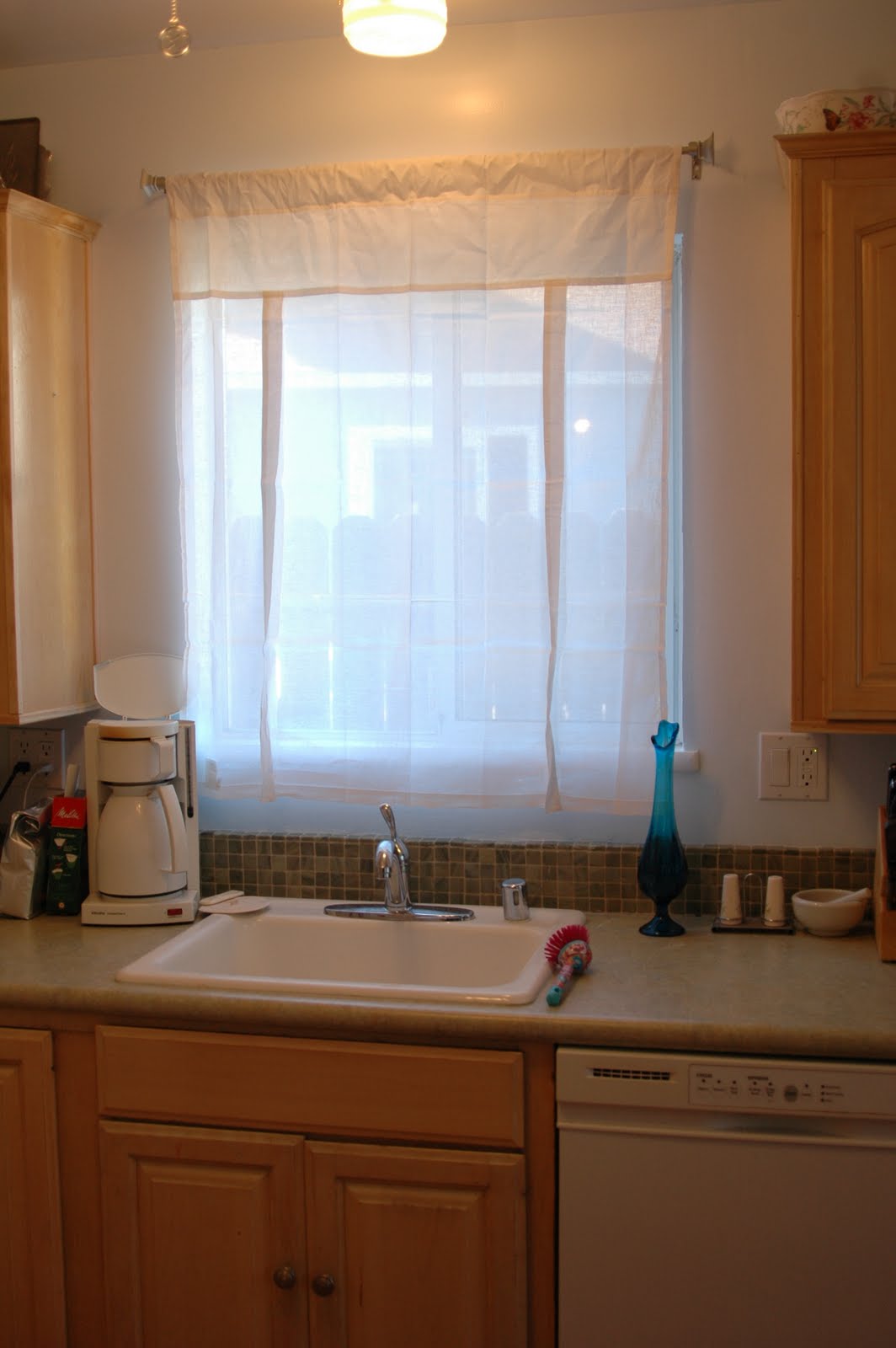
Light blue and green are actually very hot color combo and I can see why. You can add splashes of red and white with the golden wood to good effect. I have even been able to throw in bits of fuchsia and bright blue.


I am extremely happy with the result. I have learned that you really do not need granite countertops or solid surface countertops to update a kitchen. You can get great results with a laminate like Formica.  If you have the money and absolutely LOVE a solid surface option then, of course, get that counter. My experience is that there was no design of granite or solid surface that was worth the drastic leap in price. It was $480.00 to get both counters done. To get Caesarstone, I would have to spend about 5k. Given this remodel cost more than we were planning, the added cost of 5k would have been just unbearable. The thing is I wasn't in LOVE with any of the solid options. Plus, there are trade off with all types of solid surface options. Going with Formica allowed us to do a lot more with the kitchen as a whole.


Friday, August 6, 2010

Resistance is Fertile: Sitting on a Red Couch chatting with Fidel


© 2007 – 2010 Michael Eastman Red Couch, Havana

Visiting Kitchen Clarity yielded this gem of a photo, Red Couch, Havana from photographer, Michael Eastman. Beautiful. It makes me want to spend time in Havana. Needless to say I have to add Havana to my list of places to visit. Look at his photos and you will find Havana's architecture is off-the-hook. I appreciate the faded opulence with rustic communism. Then you have these moorish detail and Caribbean colors, audacious but perfect contrasts. Pale blue walls with a red couch. I am certain my red Kitchenaid Artisan blender will look great with my pale wall.

Oh Fidel
, I am so sorry my bourgeoisie house-wifishness is showing. What I mean is blue, green, white, and red are revolutionary combos and neutral colors are counter-revolutionary.

Michael Eastman also has Abstractions. Here is one of my favorites, "Resistance is Fertile." Indeed it is - a play on "Resistance is Futile". Saying that resistance is fertile is so hopeful as it is subversive.

While I think that simply tagging is mindless and evil vandalism, thoughtful and clever graffiti that makes a statement is acceptable. It is often inspired when it is an act of media or culture jamming. Surfaces that have layers of posters, paint, and graffiti have a certain beauty to them. They are multi-sourced collages of urbanity. They add color and food for thought. In films as well as real life it is the way for the streets to mumble and make graphical shouts of resistance. Sadly, I haven't come across any inspired graffiti in very long time.

Then there is the nature of resistance. What are you resisting, what can't you resist? Do we even know how to resist anymore?

We were nearly reduced to a landscape of lost hobos by a financial system that allowed no resistance against the forces of consumerism. If you couldn't resist that new 50k-70k kitchen it was okay you could always borrow against your house. It used to be what helped people resist buying something was that they couldn't buy it until they had enough money to pay for it.

A young relative once sold us a used vehicle in a pinch. In order to take our check they had to do a credit check. She fluttered back to us chirping that with our high credit rating we could buy a pair of NEW Escalades! The reason why we could is because we don't do things like buy twin Escalades. One of our friends called their credit union and found out he could borrow a five figure sum and was psyched that he could buy a sporty utility vehicle. It was like an old joke that goes, "How can I have run out of money, I still have checks!"

It is like the 1990s where people were making purchases on paper money that was merely paper money on a whole precarious house of cards. People made fun of me for not investing entirely in tech stocks. It is like how a whole generation of people were using their homes as ATMs, and looking down on us for not following suit and keeping up at night. Later, I got to witness the wicked aftermath of the downturns and the effect they had on people and communities around me. I got angry after this latest downturn as it effected me even though I played no role in it and tried to warn people of the coming downturn and what they were doing was based on crazy wishful thinking.


Blue Window Grid by Michael Eastman

Why is this all boiling to the surface today, Fidel? It was a thread on Gardenweb, a forum for home improvement (which is just another way to encourage the anti-revolutionary consumerism), about counters. It starts with a question about how far to go when there is no pressing need, but a desire to refresh the kitchen. There was a spouse who also wanted to work on another room as well and wanted to wait to do anything significant with the kitchen. Formica was brought up as an option. There was granite, she only liked the granite that was at the top of the price range. You could tell that there was a significant coven of those who love granite and were trying to convince her that granite was better than Formica and her husband is just being cheap. It is one thing to prefer granite. It is another to make judgments on those who choose Formica or a laminate over the trendy granite (a material I don't even like and is not appropriate for all kitchens).

It is with a certainty I tell you that there are hundreds if not thousands of foreclosed homes and people who are house-poor that granite is a cold comfort. If I went with granite and later my family had to go without because I spent part of our cushion on it, I couldn't look at it without a sense of shame. When I look at Formica, I can look at it guilt free. $500.00 bucks as opposed to $5k. Oh, that's easy.

After this thread, getting Formica is a form of resistance. It is a resistance to this mentality that we should all have neutral colored, over-sized granite kitchens that look like what all the magazines and television shows (I am looking at YOU HGTV, guilty pleasure that you are!).

New battle cry: F*ck that, I'm getting Formica! Viva Le resistance!

Now I would love to do concrete or Earthcrete (it is not shiny like granite) counters, floors, sinks, and fireplaces and just go crazy refacing my house and do the backyard with a pool. It would be beautiful. I do not need that to be happy. It is not a need, but a want. More likely it is stuff of a really involving fantasy. I see how people, even I, blur the distinction between want and need. The difference is that I slap myself out of it and keep it a fantasy. It would surely be a turn on to turn our house into a work of art. I am just going to scale it down so when the revolution starts I will be passed over by the masses for the counter-revolutionary granite owners.

It is no secret I have a luxury real estate fetish. The sexiness of the properties I love isn't the prestige or necessarily the opulence. The 20 million and higher properties tend to be too garish for me. Around 3-10 million can get you a place with history and beautiful architectural features that is absent from the countless hills of McMansions. The attraction is often location -- Paris, an ocean, Merrikesh, Istanbul, Southern France, and Southern Italy. My fetish is for craftsmanship that has disappeared perhaps as far back as the Industrial Revolution. My fetish is for evidence of the artisan. It is also just a fetish of a person who loves looking at pretty things but through the eyes of someone who is unconventional. I had a needlepoint of Lenin hanging over my son's changing table.

Resistance is fertile because it gives birth to new possibilities, new thinking, and new attitudes. It frees you from conventional, cookie cutter little boxes. Resist and see what happens.

Not surprisingly, one of my many fantasies involves running the revolution in halls and parlors of exquisite architecture or being a vagabond being able to move from luxury villa to luxury schooner to vintage teardrop trailer. With henna'd hair and tattoos, smelling of vintage perfume, and wearing comfortable shoes I am looking forward to going on a journey whether it is outward or inward. Wanna come along?

Thursday, August 5, 2010

Falling into Place and Setting a Date

Today we picked up the Metal Ocean counters that we ordered last Friday. They look better than I hoped. No matter how big the samples are (I got multiple 5x7 samples even), they never do the counter justice. You really notice the golden color, which will compliment the cabinets. By the way, I do have lots of Formica and Wilsonart samples if anyone needs. As you may know already, my tile is in and I am very happy. I will go 5 inches with the 1 inch tile, but 3 inches up I am inserting a row of the 5/8 inch tile to make it more interesting. Plus, I couldn't send them back because I love them so.

We just spoke with our contractor and we are tentatively set to start work on the kitchen 8/30.

I had a friend come over yesterday and she thinks that the color we used was Calypso Breeze. She even remembers me saying something about Calypso Breeze back six years ago.
Since we cannot agree on a green and the off-whites/yellows are too creamy for stainless steel, we are going with the blue Calypso Breeze. It goes with the cabinets and the tile, since anything I picked had to go with the blue since the kitchen borders with the dining and living room space.

Speaking of stainless steel, I was hoping someone could give us advice on the shelving whether we should go with 16 gauge or 18 gauge stainless steel shelves. Currently we are looking for two 84" inch stainless steel shelves. I imagine we will be putting our bowls, colanders, electrical gadgets, steamers, and recipe books.

We are getting rid of the soffits and updating the light fixtures.

This month better roll by quickly.

Tuesday, August 3, 2010

Tile Arrival and the Color Crisis of 2010

Good news. The tile is here. The bad news is that the blue I wanted isn't Benjamin Moore Caribbean Mist, but some blue from KELLY MOORE. Six years when we painted my son was 7 months old and I am pretty hazy I guess. Thanks to a friend on Gardenweb's Kitchen discussion board, I was able to go and get a fandeck of Kelly Moore colors and it is between two colors: Dreamy Space and Calypso Breeze for matching the wall.

My secret hope is for Dreamy Space to win, but it is so close.


Just so you know I can think outside of the box. Here is a gold color that would pick up the gold in the counter.


Here below is the tile with a series of off-whites: Swiss Coffee, Frost, Bone, and some other color. Bone caught my eye and I am thinking Swiss Coffee as accent.


So I am not sure what I want to do. I can see if I can get testers for the blues, because we still need to touch up the existing paint. Another consideration is I can go a slightly darker shade of blue. It turns out we are going to keep the little tile and make a single row in the upper half of the backsplash.

Monday, August 2, 2010

Kindred Kitchen Spirit


This image is from Sabjimata's blog and I admire her color scheme and use of stainless steel shelving. Check out the rest of her photos and there is a kindred spirit in terms of the design aesthetic I like. Hers is a larger kitchen than we have, but I think that we can achieve the spirit of this space on just a smaller scale. We will probably get the stainless steel shelves when we pick up our counters. Stainless shelves seem more substantial than particle board and project more culinary gravitas.
Shhh...don't tell my husband, but I am contemplating re-purposing a french style dresser we have in storage as a kitchen sideboard to go under the stainless steel shelves. It has a a lot of drawers where kitchen stuff can go. We can put white ceramic tile or some on it cheaply. Leave me alone googling kitchen ideas plus have me go to a French themed store that has our French style dresser repainted -- i get dangerous ideas.

Part of me wants to get a working green rotary phone for the kitchen, but when we call Kaiser advice line, we do need to have a touchtone phone. Otherwise, I am hankering for some analog goodness. That is a whole nother post.

My husband gets nervous when I start visualizing and imagining what we can do with our living space. What he must realize that those musings are far less expensive than my other daydreaming topic -- luxury real estate. Honey, it is either this, or a villa in South of France. Stay tuned because at some point I am going to share some properties in France that I have fallen in love with.

Be back soon.

Sunday, August 1, 2010

Caribbean Mist to the Rescue?


In my determination to have a "Green Kitchen" I found the most beautiful green marble tile, but what color would the walls be? I would have to find a shade of green my RG Colorblind hubby could register nicely, that is pale enough to focus the attention on the tile.
After being disappointed by too many green paints and by the mixing skills of Home Depot, I am retreating to a color I know works with the lighting of the house -- Benjamin Moore's Caribbean Mist. The answer to my color problem was staring me right in the face as I painted our computer room Caribbean Mist. It is in our livingroom/dining room that looks onto the kitchen. Having a pale blue, medium/pale green, and white is a scheme that seems to work in rooms including kitchens.


This feels like a breakthrough. So we can do pale blue walls, white trim and ceiling, and green marble tile. I can still do those Pottery Barn white curtains. I may have to consider sturdy white wood cafe shelving (shown below) instead of the stainless steel (either one would work). Not sure if we have to paint the cabinets yet, but I am open to it. We could paint the cabinets white or a matching green to the tile.

Let's not forget the Metal Ocean countertop. Metal Ocean has both blue and green hues that could play off both the green tile and the pale blue walls.

So tomorrow I am going to make a trek to Benjamin Moore and get some Caribbean Mist, since I need some to touch up the walls in the livingroom, dining room, and computer room.
The benefit of going with the Caribbean Mist is that I know it is a color I can live with. It is also a color that can go with stainless steel as well as white.

A Blue Kitchen


Should I just paint the kitchen the same color as the adjoining livingroom and diningroom? It would go with the stainless steel shelving, countertops, white trim, and make the green tile pop. There is a chance that we have leftover paint in semi-gloss left. Of course, the photo does no justice to the countertop sample.

Saturday, July 31, 2010

Kitchen Paint and the Road Ahead


Originally, I was going to go with Celery Ice by Behr, but the color really didn't work on our walls. My husband eyes register yellow greens far better so I turned to a yellow green (Behr Feldspar), a green yellow (Behr Home Song), and a yellow (Behr Garlic Clove). Using Photoshop, I was able to insert my tile and countertop. Once I finish prepping the walls I am going to try out the testers I bought to see which one we like.

The tile and countertop should be arriving next week. By then, the walls will be ready for our contractor to fix what is wrong with our walls and paint. Then he can install the counters, cooktop, and the tile. We had inherited some bad patches on the walls that were covered badly by poorly put on wallpaper. We tried to fix it ourselves but wasn't happy with the results. We are going to do as much of the prep work we can ourselves, so he can just come in and finish up.

We are also contemplating getting commercial stainless steel shelves for our kitchen storage for bare walls that are 88 inches long. I want to break it down for 2 56 inch shelves and 2 36 inch shelves, because in the future if we want to put in a 36 inch refrigerator or double oven, we can take out and reuse the 36 inch shelves elsewhere more easily than 84 inch selves.

A lot of this work will involve organizing the entire house. Our house is cluttered and we need to find a way to simplify, declutter, and make our house work better for day-to-day living, but also to entertain kids and adults.

Wednesday, July 28, 2010

Metal Ocean vs. Seagrass Strand

It is frustrating that I cannot seem to get an accurate hue on these pictures.

So it really is between Metal Ocean and Seagrass Strand.


Metal Ocean.


Seagrass Strand.

My concern is that the Seagrass may be too busy against our floors. What do you think?
This is Metal Ocean against our floors.


Thursday, July 22, 2010

Still Reconsidering Countertops

Below are some pictures of Seagrass Strand and Metal Ocean. The first two are the Seagrass Strand and the last one is Metal Ocean. I have asked my supplier if these come in different finishes...


Update: Just found out that Metal Ocean and Seagrass Strand come only in Matte finish. Is the Matte finish going to be boring? They will be less expensive than the Crystalline Iris which is the top of the line Wilsonart, while Metal Ocean and Seagrass Strand is the bottom of the Formica. I really wish that they had a texture. What I liked about Madras Indian Slate is that it was honed. Crystalline Iris has texture to it and has a deeper more interesting pattern.